Sunday, February 16, 2014

Using Pastels and Gesso to create Art Journal Backgrounds

I think I first used this technique in the House and Home book I made for my sister, Kate. I don't remember where I first read about the technique. For this post I did two journal spreads, one using cool tones and one using warm tones. The main image in both is an image I snagged off the internet to help me in my attempts to learn to use Painter X, a program I've had for a number of years but never learned to use. I also made "learning" the theme of both pages.

 Scribbling heavily with warm tones of the pastels in a 5" x 8" Moleskine journal, with a few added accents of blues and greens.
 After painting the gesso on, I thought it was a little too pink. The streaks of green are from small chunks of pastel chalk I forgot to brush off that got caught in my brush. I just brush back and forth a while and then up and down. If desired, you can paint the gesso onto all the yellow, then orange, etc which give a different look. I was going for smeared and smudged. Too much gesso will turn the whole thing white.
 More yellow and orange pastel over the dried gesso. I forget to photograph the pages before I started journaling.
 Since this was more about the backgrounds than the journaling I used a technique described in "Journal Spilling" of quickly choosing magazine images and words and arranging them on the pages in a pleasing manner. I had printed the Painter file in warm and cool shades to use on the two spreads but this nude definitely looks a little chilly.
My pastels - one rather pricey set I dropped and broke and one inexpensive set. They all work!

 The second spread was in my junk journal on a GelliArt page gone very wrong.
 The cool colors of pastels applied heavily, together with some warm tones.
This is pretty messy because I was using too much gesso and paying no attention to where the colors stopped and started.

                                  
 I applied more chalks (above) and used a less heavy hand with the gesso (below).
 The last photo is the finished journaling page, same magazine, same general technique, with some stamping on the pages and some shadowing of the images with Caran d' Ache and Portfolio crayons. I got the quotes by Googling "quirky learning quotes" and loved both of these and quite a few others as well.
Personally, I really like the less than perfect backgrounds with interesting color blends that this technique produces. Very serendipitous. I hope you find this useful!!

Thursday, October 31, 2013

Halloween Witches and Creepiness

I've mostly been working on some figures, polymer clay and Paperclay, during my spare October time, but I haven't managed to finish even one of those. I did get inspired to finish a Halloween page in my "Teesha" journal, a really creepy digital collage and a digitally colored Sweetpea witch. So just a little while before the witching hour of Halloween, I'm going to share those.


 I didn't know any "witch" nursery rhymes for my "Teesha" journal but found several really cute ones online searching on "witch nursery rhymes". She's a little different than the rest of the pages in that I left her BJD eyes. Her dress is from Raphael Tuck's Antique Paper Dolls, a book I've had for ages; Dover, I think. The pumpkin stamp at the bottom is from Queen Kat.


I've been working on this one for quite a while. All I knew I wanted to use was the photo Pam took at the Ohio Reformatory in Mansfield. I did an image adjustment on it to make it blue, took most of the glass out of the windows and added the moonscape. The girl, an online find, was standing in water which I turned to blood. Skeletons are a must for creepiness - I think these are from Flickr Commons. The Bleeding Hearts, flowers and otherwise, came from my desire for a creep factor.


This sweet little witch is a Sweetpea image. I've bought a ton of their witches and used only a few so I was quite happy using this one for some Halloween cards.

Thanks for visiting! 

Tuesday, October 22, 2013

Loving Photoshop Tutorials

I learn a lot from online Photoshop tutorials. My favorite kinds are the ones that don't include video as I frequently need to recheck the steps which is so much easier in a textbook format.
Well, I bought my third or fourth copy of Somerset Digital Studio recently and instead of getting bent out of shape that all of the lovely layouts were made from digital kits, I decided to go look at some of the digital kits. Being a bit of a slow learner I have a hard time jumping on a new bandwagon. Well, the kits are amazing and lots of brilliant designers have created so many papers and elements and clipping masks (still have to find a tutorial for what those are) that it's tempting to spend my year's craft allowance on the kits. And I will buy some but I also recognize when clip art has been artfully manipulated and I wanted to learn how to do that.
I fiddled around for a day or two using my digital coloring skills and getting nowhere and then I decided to look up a tutorial for coloring old photos. I read several but here's the one I liked the best: {Sorry that was a very bad link} . And here's what I did with it:


It's slick as can be and the really cool part is that I can go back into the unflattened file and change any or all of the different colors I used for a different look. And the selections are already saved because I used layer masks to add the color.

Saturday, October 5, 2013

Airless Chambers: October Newsletter Freebie Contest

There'a an October challenge going on over at Airless Chambers, the darker Rick St. Dennis blog. The challenge requires the use of Callista, who was given as a freebie in Rick's October newsletter. There's lots of eye candy currently on Airless Chambers as many of Rick's Design Team have posted their Callista projects. If you don't receive the newsletter be sure to sign up for future news. Callista is a still available for purchase in Rick's Etsy Shop here.

For my entry I created the haunted house background paper digitally and colored Callista digitally, all in PS CS5. She was great fun to play with!


Thanks for visiting!

Sunday, August 25, 2013

More Pages from My "Teesha" Journal

WOW! I just looked back at my posts and saw that I started my journal based on Teesha Moore's Fantastic 16 page Journal videos in May. It's closing in on September and I still have a page or two to go, but I just finished this two page spread and I love it! More to come!!


I've used paper doll clothing, faces from ball jointed dolls, eyes from fashion magazines and border papers from various sources: magazine pages, scrapbook paper, etc. The pages are painted with watercolor washes and then rubbed with pastels. The pen work was done with the black and white Sharpie water based poster paint markers that Teesha recommended. I found those at Dick Blick online. I even managed to squeeze in some rubber stamp fishies and the moon face from Artful Illusions.

Wednesday, August 21, 2013

Halloween Colors Challenge at Simply Betty Stamps

After I saw this sexy "Witch Mercedes" from Simply Betty Stamps, I knew I wanted to play with her. I hurried over and joined the SBS Facebook group and although Facebook always stymies me I did manage to find my way around and snag this cutie. All of the work was done in Photoshop. The spider web and the creepy spider are from photos I've taken and the trees are PS brushes from Trees_by_Horhew.


Thanks, Betty, for "treating" us to this delicious challenge!!

Friday, July 26, 2013

Smeared and Smudged Rock n Rolla Challenge "Walking On Air"

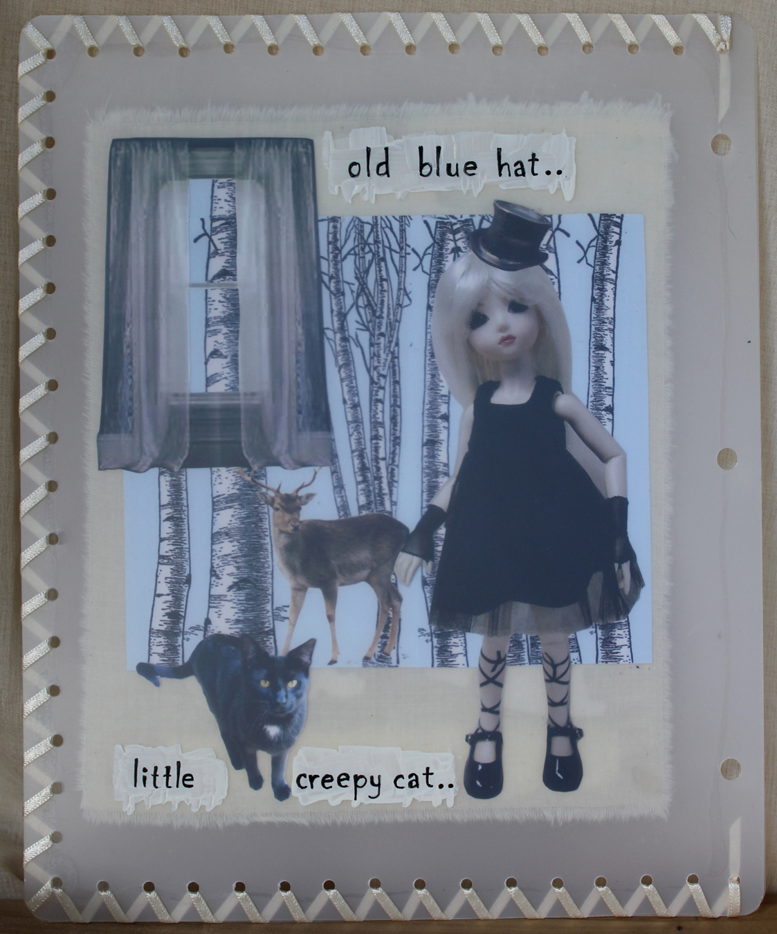
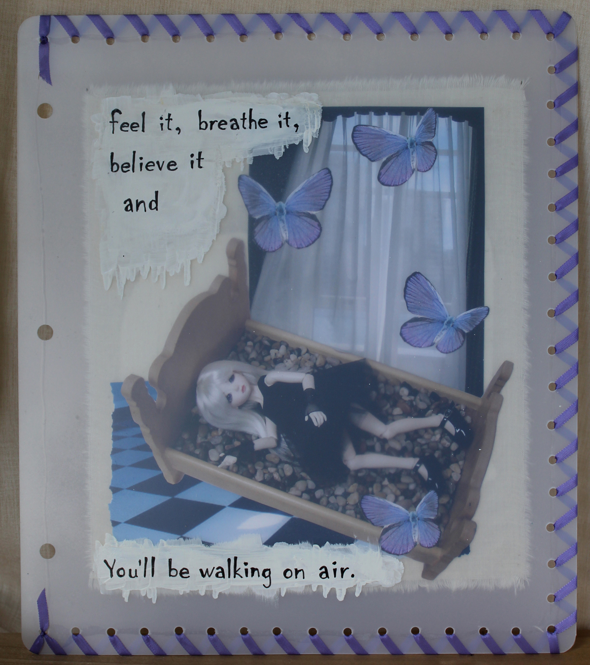
Hang onto your hats - I've got a bunch of pictures for this one. The challenge here was to use Kerli"s Walking On Air video for inspiration. It's the July 2013 Rock n Rolla challenge on Smeared and Smudged. I made a booklet with 8 small collages. I had meant to use cereal bags to enclose them as I had seen in Cloth, Paper, Scissors latest issue of Pages but I couldn't get that to work. I liked and wanted to duplicate the translucent look of the cereal bags so eventually came up with frosted shrink art plastic.
Two collages were mounted onto the front and back of a little piece of muslin and the whole thing was sandwiched between two pieces of the frosted plastic which had been trimmed to size. I used ZipDry glue for all of the gluing. Then thinking how easy it would be for the plastic to get snapped apart, I laced the edges with ribbon after punching all the holes. Here are the eight pages:


The stamp here is one of Ike's fabulous digis. This one is "Vaguely Goth". Isn't it just perfect?


 The last and hardest part for me was lettering phrases from the song onto painted section of the plastic. Hand lettering never gets any easier! I made a cover for the booklet because when I hauled out the old shrink plastic, I noticed that the edges that had been exposed to the light had yellowed slightly. Now if I were really in an experimental mood I could throw the whole thing in the oven and see what happened. No, I don't think so!

Thanks for visiting!!